Insights Dashboard
Comparing Stats Between Time Periods

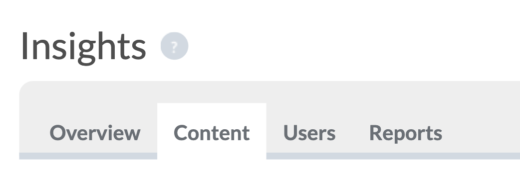
In this step we'll look at comparing stats between different time periods using theContent Tab on the Insights Dashboard.
When you open the Content Tab, by default it will show a comparison of Today vs Yesterday. The first thing you'll need to do is choose which time periods you want to compare. Use the drop-down menus on each side to choose the two date ranges to be compared. Then press the Update button to run your query.
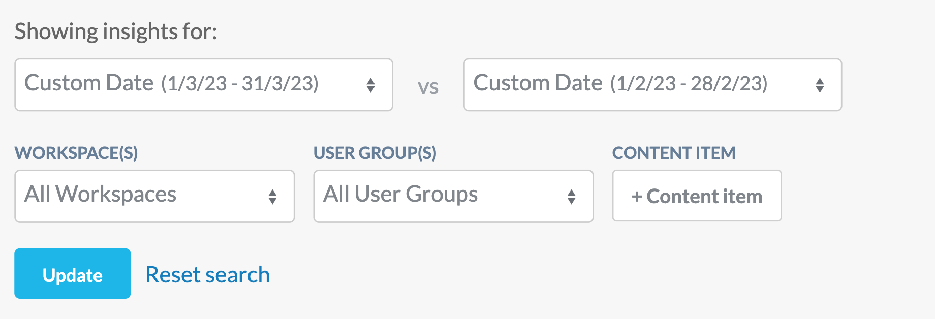
In the example above we have used the custom date option in the drop-down menus, and chosen to compare March 2023 with February 2023. You'll also see options here to select specific workspaces, user groups and content items, but don't worry about those for now - we'll come back to those in a later step of this Learning Track!
Comparing the Key Stats Breakdown
After pressing Update, you'll see that the Key Stats breakdown appears below, just like it did in the previous steps of this Learning Track on the Overview tab. Except this time, each will show you the difference between your two selected time periods, and will let you know how much each stat has either increased or decreased by:
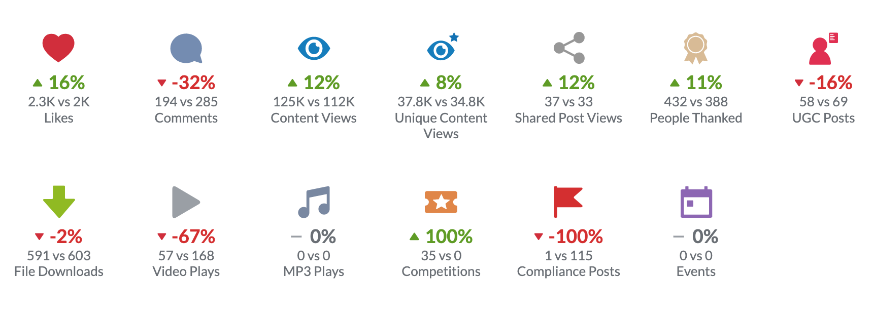
Remember that in the date-picker, we chose March vs February, so you should read this key stats comparison in the same way. In the example above, in March our number of likes increased by 16% over what they were in February (2300 likes in March vs 2000 in February). The amount of User Generated posts fell by 16% (58 UGC posts in March vs 69 in February) but our Content Views and Unique Content views were both higher in March than they were in February by 12% and 8% respectively.
Comparing Content Popularity and User Group Activity Across Time Periods
Scrolling on down the Content Tab, just like on the Overview Tab you'll see a breakdown for Content Popularity and User Group Activity. These work the same way as they did on the Overview Tab (as covered in Step 2 of this Learning Track) except that now you can use the Toggle Date selector to jump between your two chosen time periods. For example, here we're comparing Content Popularity Today vs Yesterday:
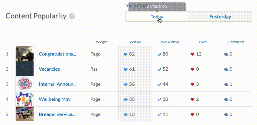
And as was the case in the Content Tab, you can also click each of the column headers in the Content Popularity table to re-order the list by Views, Unique Views, Likes or Comments.
Finally, when you use Date Toggle to select the first time period for your comparison, you'll also see indicators to tell you if the content is more or less popular than it was for the other selected period. For example, when selecting Today vs Yesterday like the example above, you'll notice the icons beside each piece of content:
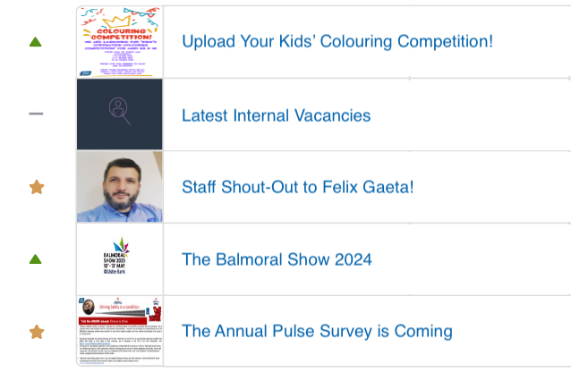
Green Arrow Up:The content is more popular today than it was yesterday (or whatever other period has been selected for comparison).
Red Arrow Down:The content is less popular today than it was yesterday.
Golden Star:The content was only just created during the first time period, and didn't yet exist during the other selected time period for comparison.
Grey Line:The content's popularity position has remained the same across both selected time periods for comparison.
Well done! Now you know how to compare your key stats, content popularity, and user group activity across time periods. This is really useful for keeping an eye on how your app's usage is trending over time!