Insights Dashboard
Content Popularity and User Groups Activity

Just like the previous step about key stats, you'll need to use the drop-down menu at the top of the Overview Tab to select a time period or a custom date-range. All the key stats and the overviews of content popularity, user group activity and list popularity will update to show you the insights for your selected time period.
Content Popularity Overview
This section of the overview tab shows your most popular content during the selected time range. By default, the content here is ordered by most viewed to least viewed:
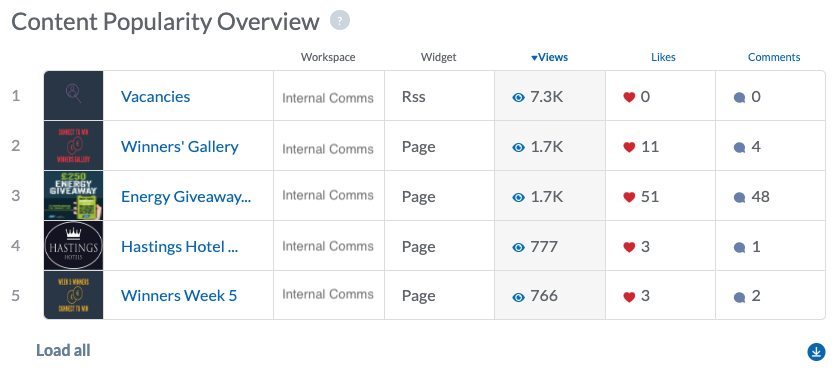
Press Load all to expand the list and show the full top 100 content items by popularity (views) during the selected time period. As was the case with the stats breakdown window, you can click on any of these content titles to be taken directly to that content in the CMS.
Note:If you're looking for the number of views / likes / comments for a particular piece of content, but it's not in the top 100 list of content popularity, you can find it using the 'Content' tab of the Insights Dashboard. We'll cover that in a later step in this Learning Track!
The Content Popularity Overview list is by default ordered by views. However, you can also re-order the list by most likes and most comments. To do so, simply click on the Likes or Comments column header to re-order the list:
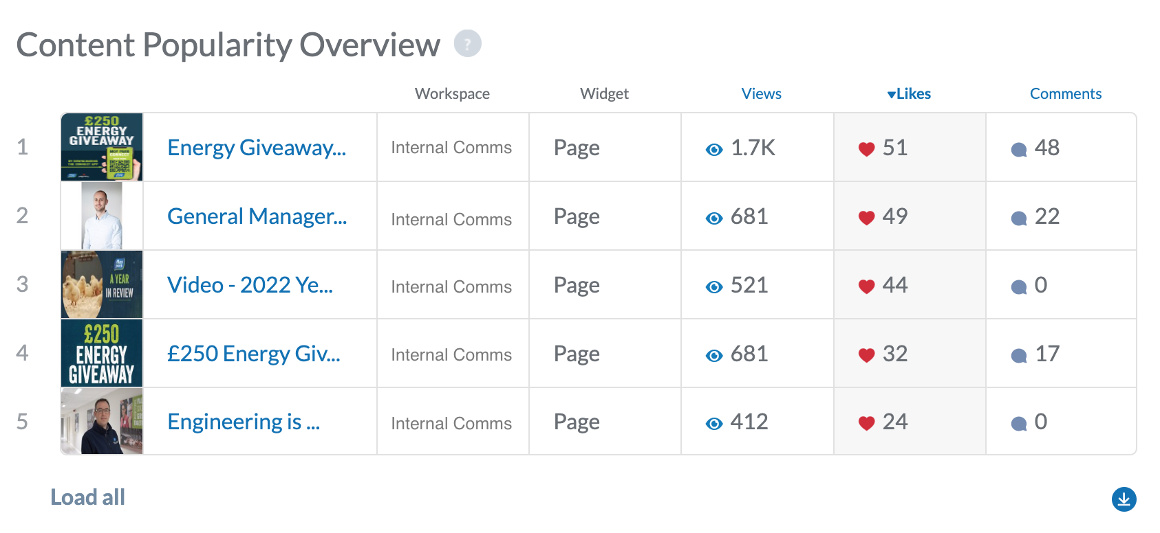
As you can see from the screenshot above, once we click on the Likes column header, the list is re-ordered to show our most liked content.
User Group Activity Overview
The next section of the Overview Tab shows how many views, likes, comments, etc each of your user groups are responsible for. By default, this list is ordered by Unique Views and just like the Content Popularity Overview, you can click on each of the column headers to re-order the list by the various categories:
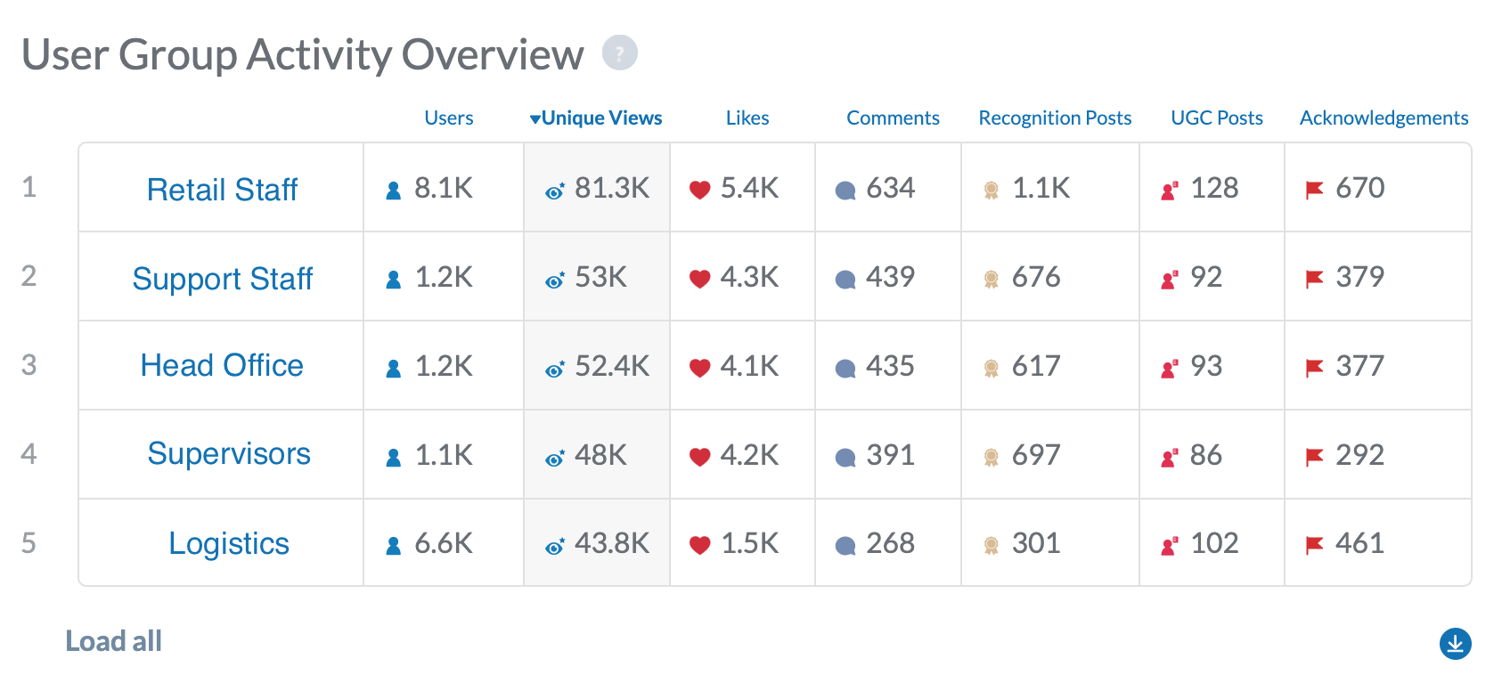
To help you contextualise the stats presented in the User Group Activity Overview, the table starts off by showing you how many users are in each group. In the example above, we can see that the group responsible for the highest number of views is the Retail Staff group. That's not much of a surprise as it's also the group with the most users. The Support Staff, Head Office and Supervisors user groups only have around an eighth of the amount of users as the Retail Staff group, but are responsible for around two-thirds of the views, likes, comments, etc of the Retail Staff Group.
So you'd want to ask if there's a reason that the Support Staff, Head Office and Supervisors groups seem to be so much more engaged with the app than the Retail Staff group. (Retail has eight times the number of users, but nowhere near eight times the amount of views, etc). Is there something in the app that these groups are finding to be particularly useful? Or is it perhaps that you just need to do a better job of promoting the app's availability to the Retail Staff? The data presented in the User Group Activity Overview allows you to begin asking these kinds of questions about your app's usage among various groups of employees.
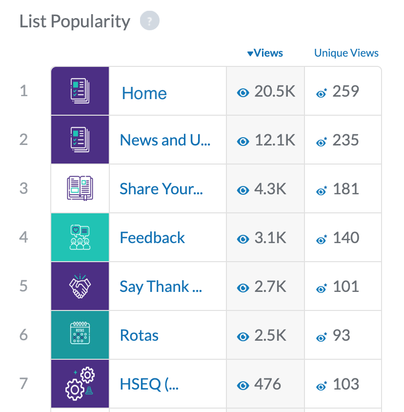
List Popularity
Finally, the last section of on the Overview Tab shows your List Popularity. The easiest way to think of this is the popularity of the 'tiles' on your app's homescreen. Seeing as everyone lands on the homescreen when opening the app, that will usually be the List in position one:
Use the data here to understand which parts the app are being visited most often. You can also use this section to get a feel for whether the structure of your app is working - if perhaps there are sections that are not being visited, do they need to exist if employees aren't finding them to be useful? Or is the problem just that they're buried as a list within a list and need to be surfaced on to your app's homescreen instead?