Insights Dashboard
Get a Snapshot of Usage and Key Stats

Our first step is on the Overview tab of the Insights Dashboard. This tab is for getting a snapshot of your stats from a particular time period. You can also compare stats across time periods, but we'll cover that in a later step in this Learning Track.
Choosing a Time Period for Your Query
Start by choosing the time period you wish to view from the drop-down menu at the top of the screen:
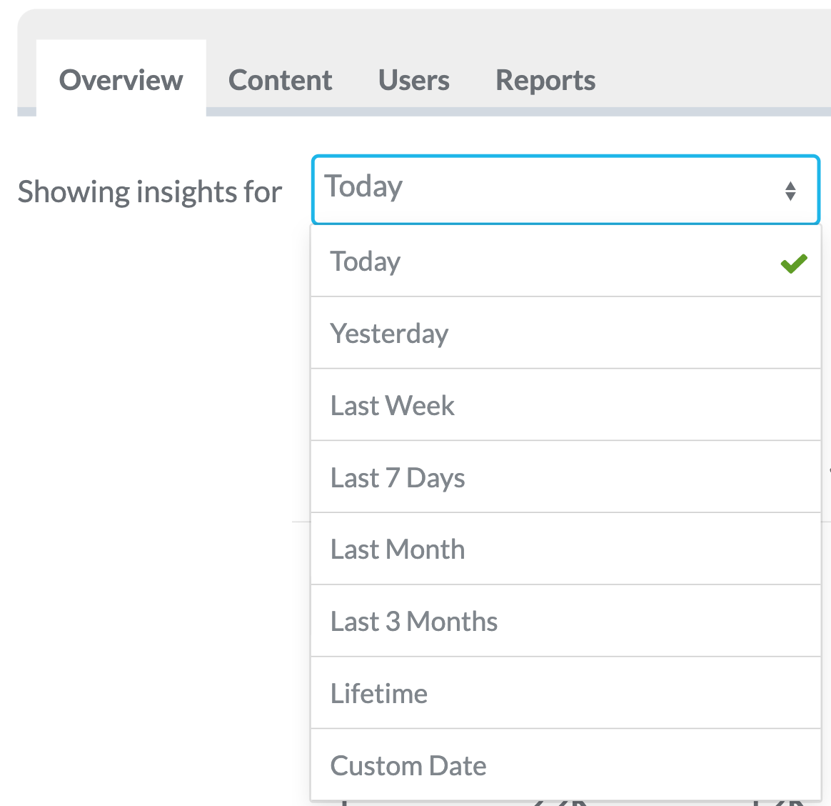
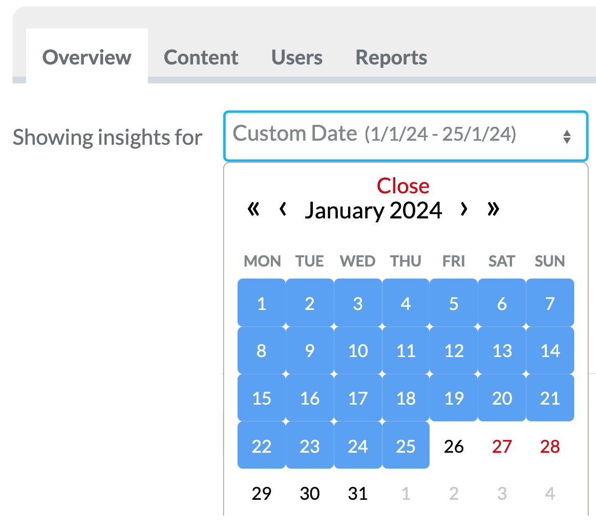
Or if you want to select your own time period to view the stats for, select Custom Date at the bottom of the list. You'll now be presented with a calendar view. Click on the date that you want to start on, then click on the date you want to end on. In the example below, we've chosen to view stats for the period of 1st January - 25th January.
How Many Users Have Registered, Logged In, and Device-Type Breakdown
The first row below the time period drop down shows us the number of users registered and the amount logged in during the selected time period. Here, you'll also see a breakdown of what percentage of your employees are using iOS and Android devices, and are accessing your desktop webapp on PC.

In the example above,during the selected time periodwe can see that:
- 390 employees registered on the app and used it for the first time.
- 2718 unique employees used the app during this time.
- 42% of employees were using iOS devices.
- 56% used Android devices.
- Only 2% of employees accessed the webapp.
A Note About Interpreting Your Insights Data
Whether you interpret these figures as positive or not, will of course depend on the circumstances of your own business. For example, if you knew that app usage among your desk-based employees was low and 50% of your employees were desk-based, but only 2% of your app usage was through the webapp, then you might consider promoting the webapp to your desk-based employees as an alternative to installing it on their own mobile devices, as a way to boost usage among that group of employees.
Analysing your insights data is ultimately a part of determining the success of your Employee App. Your insights stats are a part of that, but to really make the most of this data we recommend that you also read the following articles by our Client Success Manager on essential considerations for measuring employee app success, and how to define your success criteria and most importantly; how to measure them. This Learning Track teaches you how to get data from the Insights Dashboard, whereas the following articles will help you with putting the data to good use.
Part 1: Five Essential Considerations for Measuring the Success of Your Employee App
Part 2: What Does Employee App Success Actually Look Like?
If you'd like more information, or to discuss measurement of your own app's success metrics in more detail, get in touch with your Thrive Client Success Manager and they'll be happy to schedule a call to give advice!
Breakdown of Key App Interaction Stats
The next part of the Overview tab shows a breakdown of key stats for app interaction for your selected time period.
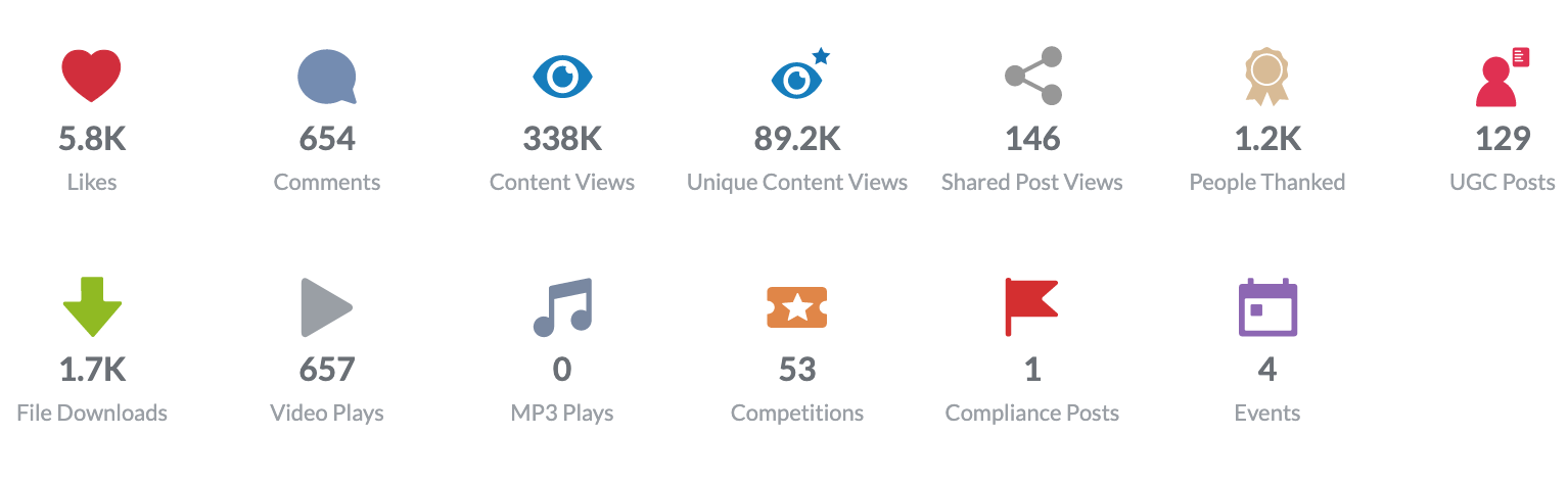
Most of these are self-explanatory, but to help you understand exactly what's being highlighted here:
- Likes:The total amount of Likes given by app users during the selected time period.
- Comments:The total amount of comments left by employees, including comment replies.
- Content Views:The total number of times that content was viewed. Including non-unique views.
- Unique Content Views:As above but removing non-unique views. If a single employee was to look at a single piece of content five times, that would only count as one unique view.
- Shared Post Views:If you have enabled External Sharing for any pages in your app, and employees have shared that content out to their social media or communication apps, this tells you how many times those externally shared pages have been viewed.
- UGC Posts:How many user-generated posts have been made in your app using our UGC feature. For more information about UGC and how useful it can be in your app, please see the Learning Track: Making the Most of User Generated Content.
- File Downloads:How many times files (usually PDFs) within your content have been viewed/downloaded in the selected time period.
- Video Plays:The number of times videos in your content have been played. Note that this only refers to MP4 video files uploaded directly to the CMS, and not to videos hosted on other services such as Sharepoint, YouTube, Vimeo, etc.
- MP3 Plays:As per video plays, but for MP3 audio files in your content.
- Competitions:The number of users who have entered competitions created using the Acknowledgements feature.
- Compliance Posts:The number of users who have responded to Compliance posts created using the Acknowledgements feature.
- Events:The number of users who have confirmed they will be attending an Event that was created using the Acknowledgements feature.
Dig Even Deeper into Each of these Stats
To break each of these stats down even further, simplyclick on each onefor more information! For example, above we can see that we have 654 comments made by employees during the last 3 months. But which content was actually commented on? If we click on the comments icon, we'll see:
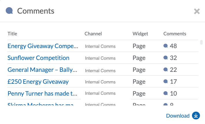
You'll be presented with a window showing a breakdown of the pages on which the comments were made, ordered by most comments to least. You can also click on the page titles to go directly to those pages in the CMS. As you'll be taken directly to that content, we recommend that you right-click on the title and choose to open it in a new tab instead! You can also use the download icon to download this data as a saveable excel report.