Adding Content to Your App
Change the Appearance and Layout of Your Lists

Within a List, you can use the Appearance tab to choose how the content inside that List will appear in your app.
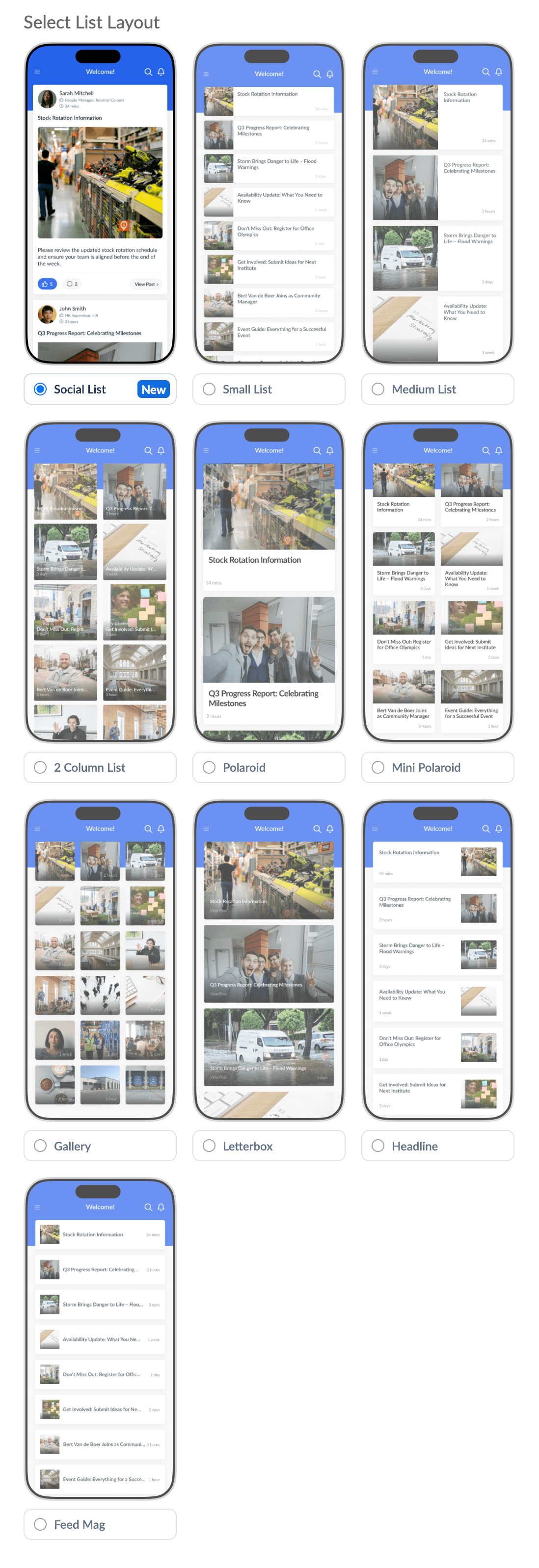
The appearance tab contains lots of options so that you can make each List in your app display differently depending on what kind of content is being posted to each one. For example, for something like a 'Latest News' List, the Headline layout might look best, with the 'Display Hero' option ticked to highlight the most recent post at the top of the screen. For something like a list of policies that doesn't have much of a visual impact, perhaps the 'Feed Mag' layout would look best with the 'Display Icons' option enabled. Whereas for something like a User Generated Content List - 'Share Your Photos', 'Share Your Good News Stories', 'Staff Shout-outs' (peer to peer recognition), the Social List Layout would look best to give that social media vibe.
Experiment with the layout options for each of your lists until you find the combination you like best for each List of content. Just remember that when you change a setting in the CMS, make sure to click Save and Publish Now so that you can see what that looks like in your app!
The options in the Appearance tab are explained below:
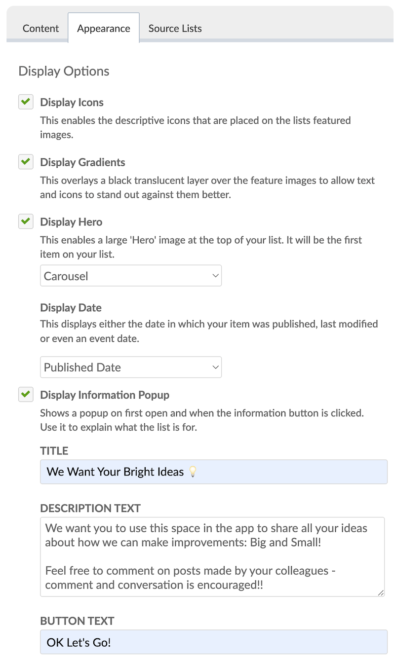
When Display Hero is enabled, you can select from two options in the drop-down menu:
1. Image: A static featured image for the content at the top of your list.
2. Carousel: An auto-scrolling Carousel showing the featured images of the five most recent content items in the list. Or i if the top item in the list is a Page, it will display images and videos from that Page.
NOTE: If you are selecting the Social List Layout, we recommend to keep the Display Hero option un-ticked. Using 'Hero' and the Social Layout together gives an inconsistent layout experience. Don't use Display Hero and Social Layout together!
You can also use the Appearance tab to set a Featured Image for your List. The Featured Image is like the thumbnail that will display with the List's title. To set a featured image, press Choose From Media Library and choose the image you wish to use. See guidance here for recommended dimensions and sizes of featured images.

You can also use the Display Information Popup section to add a List Explainer to give your users information about what a particular List is for. Either what kind of content it contains, how to use the information in that List; or perhaps what kind of content you would like them to post there.
When enabled, the List Explainer will appear as a pop-up for the user the first time they access a List in your app. When they press the confirmation button, it won't appear again for that user unless you change the text of the List Explainer, or manually reset it in the CMS to make it appear again for all users.
Please see our separate article which contains detailed guidance on using the Display Information Popup option to add an Explainer to Your List.
Finally, you can use the Appearance tab to choose a Layout for the content items in your list. Choose a Layout depending on what kind of content is in your list. Also remember that the Appearance options chosen above will also affect how the items in your list are displayed.