Blog
Give Your Employee App a New Look with Our Lists Layout Redesign
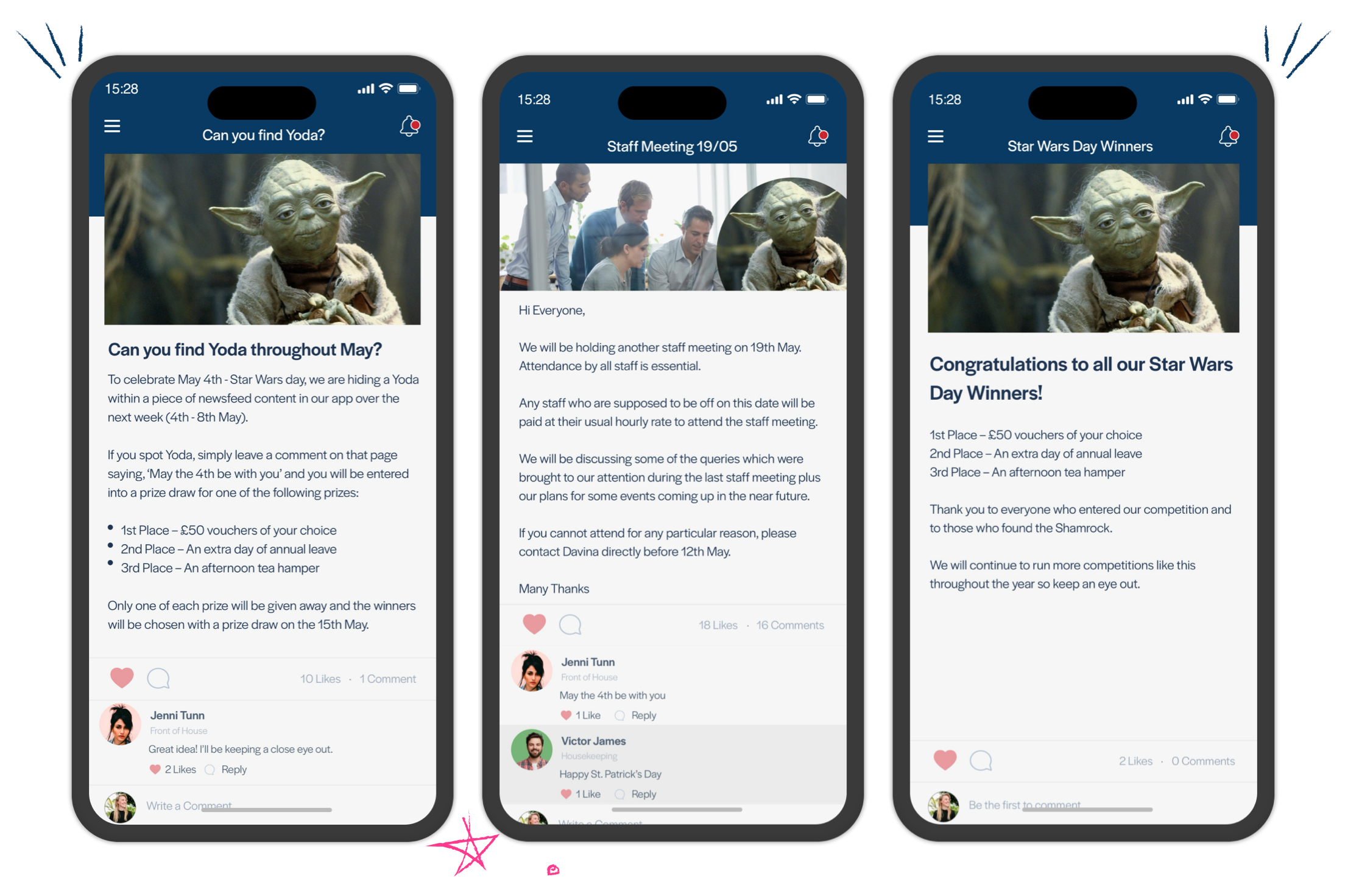
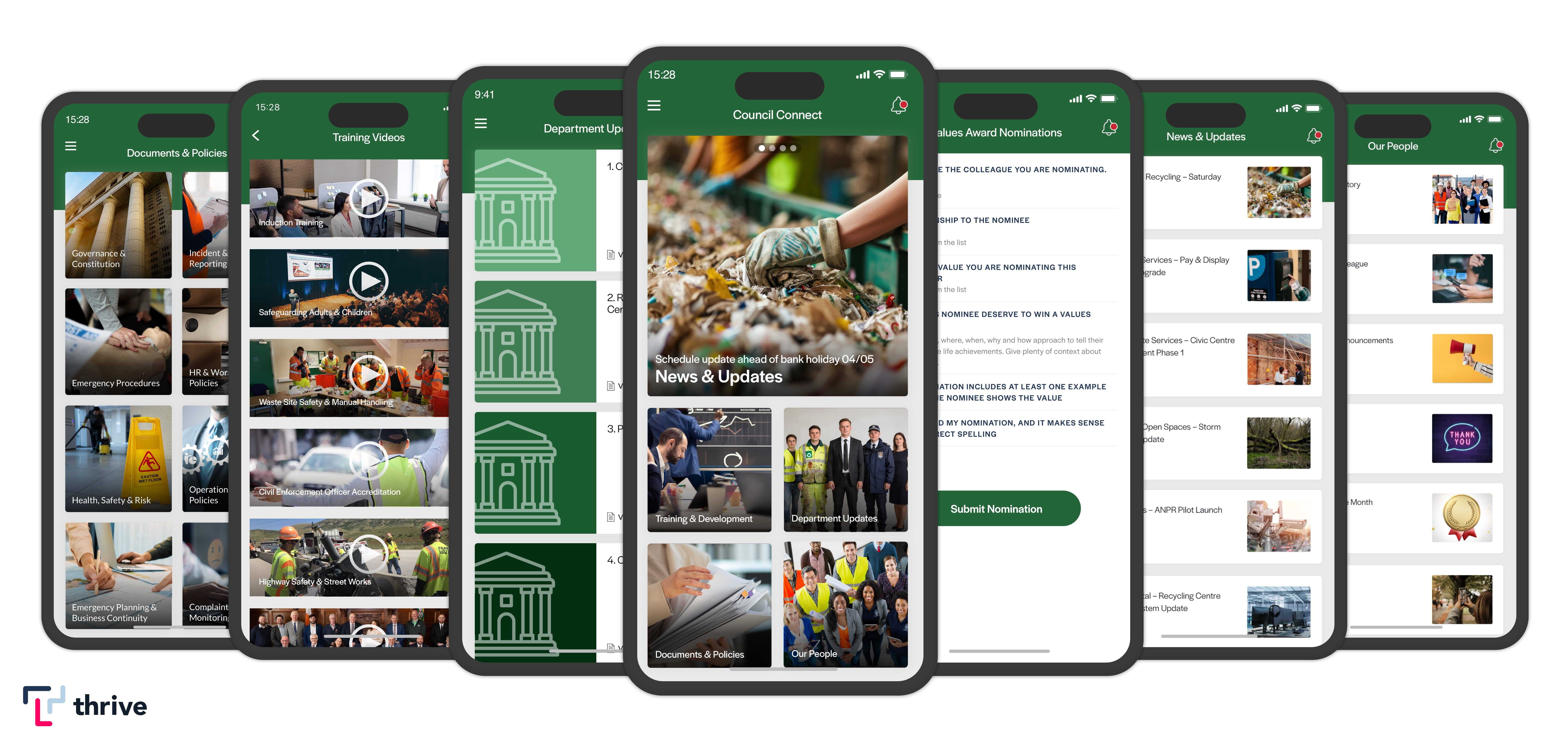
Our list designs have a new look! Here are some of our new designs to give you a flavour of what we will be introducing across the Thrive mobile and web app in the coming months.

At the start of 2021, the Product team at Thrive.App identified the need to move the mobile and web list layout designs forward to maintain the visual impact that the Thrive app creates.
Widely used consumer apps, such as well-known social networks, large news organisations, fitness companies and even mobile gaming apps (just to name a few industries), heavily influence how your employees view and interact with workplace applications. Especially when it comes to how we interact with our mobile devices.
The mass adoption and daily use of such apps and their UI/UX (user interface/user-experience) and functional design create a powerful and deeply entrenched perception of how app behaviour 'should work'. Furthermore, through their repeated use, these apps teach end users what we term 'learnt behaviour' through their design patterns, predisposing employees to automatically know where and how to navigate around apps. Given the resources these apps have at their disposal, more prominent platforms now introduce and typically lead the industry regarding UI and UX trends.
Although many design trends tend to rise to prominence quickly, and many tend to ebb away as soon as they arrive, there have been significant changes across the web and mobile landscapes when it comes to visual design patterns over the last year or two. Therefore, the Product team at Thrive.App has revisited the current list designs to revitalise and refresh the look and feel of content to ensure that your information delivery remains engaging, interactive, and has greater potency to influence change.
In this post, we wanted to share some of our new list layout designs to give you a flavour of what we will be introducing across the Thrive mobile and web app in the coming months.
Mobile App

Within the mobile application, we've shifted away from a 'flatter' design pattern to introduce new tile-based views that are more consistent with the current mobile interface guidelines stipulated by Apple and Google.
We've also introduced some new list varieties to help customers leverage specific list layouts for different content types and different purposes. For example, we've introduced 'Polaroid' and 'Headline' list layouts for a more newsreel look and feel.
These list types echo the more prominent news-based applications and help employees quickly digest general news and story content. We've also revamped but maintained important visual lists such as our 'Gallery' view to help promote photos and image lead information.
During this time, we've also taken the opportunity to benchmark and hugely improve the general performance of our lists. As a result, you'll see a noticeable difference in how fast the list will load in general and how quickly you can navigate into different lists and content items when scrolling.
Web App

Within the web app, we've looked to completely revamp the general look and feel for desktop. We've updated the navigational side menu, fixing it in place and increasing the space for content. We've looked to better promote organisation branding for a more customised feel for desktop too.
In line with our mobile app, we will be introducing corresponding list layouts for the web, meaning that you only need to pick a single design in the CMS and the web app will have a similar feel.
Furthermore, given the screen space available on the desktop, we've increased the size of content items and looked to introduce a new concept of repeated patterns when scrolling. This means that we've introduced variances within lists to differentiate the size and look of content to sustain users' interest when scrolling through your content.
What's next?
Thanks for taking the time to read through what we are planning. We are actively working on the list layouts now, and we hope to release this work within the coming months. Please let us know of any comments or questions, or if you want more information on this update, please email product@thrive.app.
To find out more about Thrive App updates, including current features and future plans on our roadmap, check out our feature updates blog.


