Blog
Our New List Layouts Are Here
Our list designs have a new look! Product Manager, Daniel Gore, shares some examples of our new designs & how best to use them, as well as the design thinking behind them.

Towards the end of 2021, we revealed that our Thrive app list designs were being given a new look and shared some examples of the new upcoming designs. I am delighted to announce that we have now released the new list layouts for our mobile and web apps.
I'd like to take some time to walk and talk you through some of our latest ideas and the intentions behind some of the list layout options you now have available.
The Web App
Let us start by discussing the all-new Thrive web app. We have made wholesale changes to our web app offering, including significant behind-the-scenes technical upgrades alongside a comprehensive set of visual updates and changes.
We've introduced an all-new (yet familiar) side menu design with new menu bar animations, better support for brand colours and workspace logo, and newly adapted tablet and mobile-responsive designs.
As well as adapting and implementing all-new layouts for the web that complement and correlate to the mobile formats (which we will walk through below) one thing to note is our new 'rolling' design mechanic.
This mechanic is exclusively available and automatically enabled, for the web app. We've introduced this for several reasons - firstly, given the 'screen retail' space afforded to us on the web, we had more 'creative space' to offer a subtlety to the visual design.
Secondly, we wanted to introduce a mechanic that would enhance the viewing experience for the reader. As a result, the web app now possesses dynamic variants to the chosen layout design when scrolling through content. We've included a few examples below to highlight how this works!

New & Updated Layouts
In total, there are now 9 layouts to choose. We've picked out a few examples to share our thoughts on how best to use the layouts and share some of the design thinking behind them.
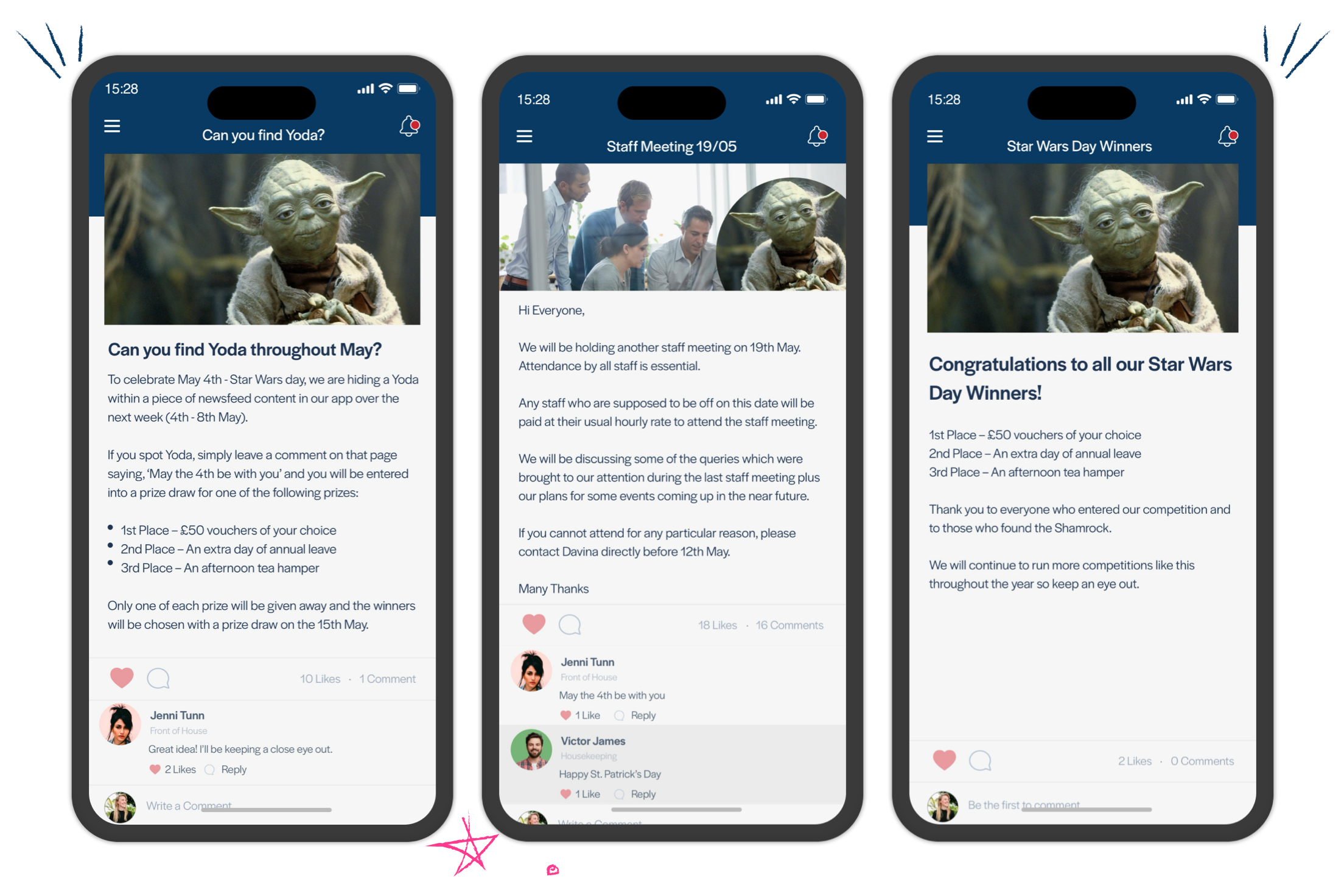
Polaroid (new)

As part of our design discovery sessions, we wanted to offer layout variants that separated title text and imagery entirely to give more options around how you can present content.
Our Polaroid layout creates a much more distinctive title text and imagery separation. It provides ample space for content featured images whilst accommodating longer content titles. In addition, the single-column format and full-width approach offer a distraction-free viewport on mobile that better highlights individual stories.
This layout focuses the reader on specific content items rather than providing them numerous content items to interact with. On the web app, the use of the polaroid layout creates a more familiar newsreel look and feel. Large images, easily readable title text, and subtle changes between two and three column splits create a truly engaging experience for readers.
Headline (new)

Our Headline list offers a more structured reading experience for employees. A layout that drives a more formal content consumption experience, neatly offering space for longer, more informative content titles with some complementary featured imagery.
As much as visual led layouts are useful, there is undoubtedly a place for formats that can be driven by text as much as imagery. This layout can be used to capitalise on the title text space to give readers more up-front information about the content before reading and relies less on imagery to drive the reader's experience.
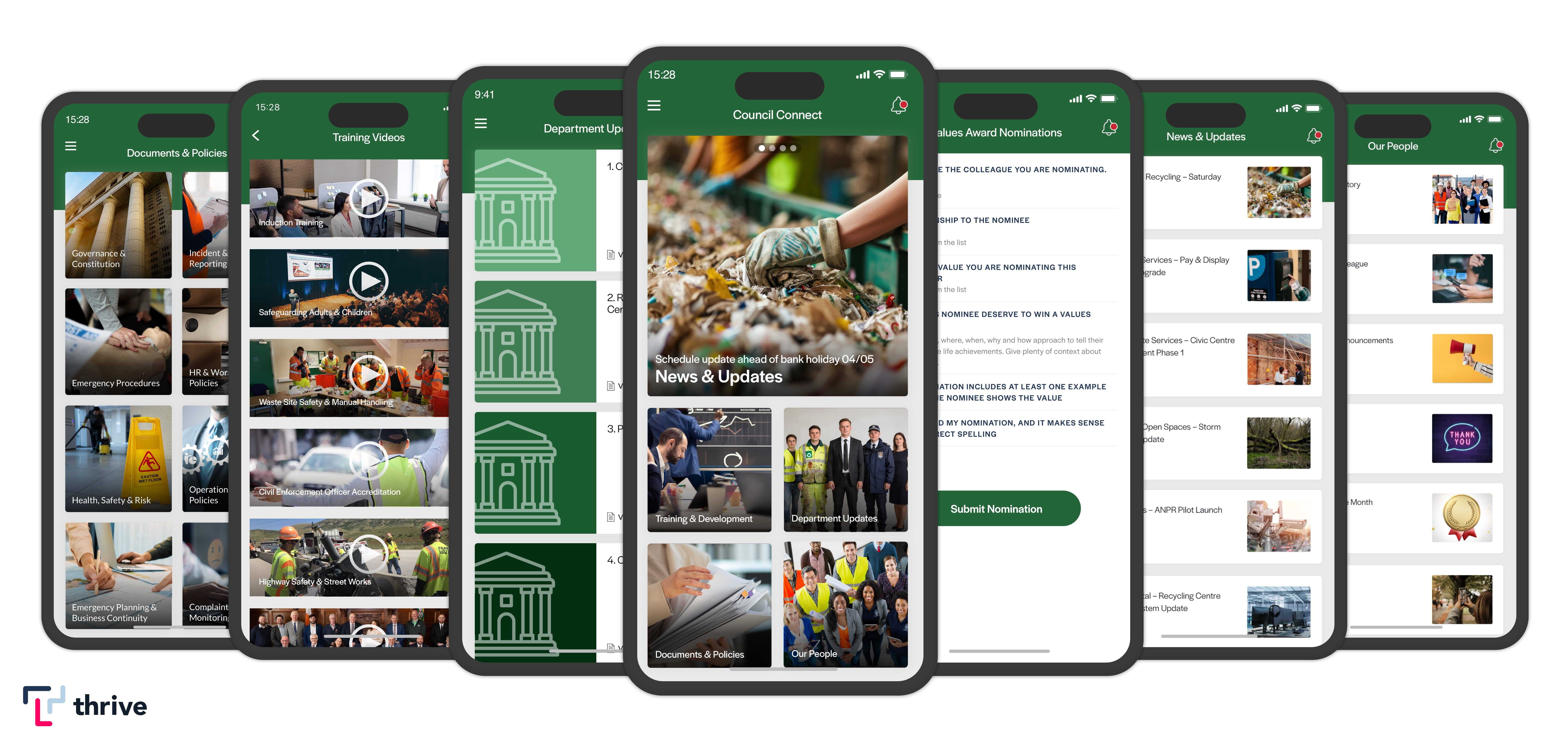
Two Column List (updated)

As mentioned earlier, our two-column layout provides that fusion between title text and imagery. This layout relies much more heavily on the quality of the imagery to engage the reader offering only limited space for title text.
Using the two-column list on both the mobile and web app allows organisations to present a range of content without overloading users' attention spans. When used in conjunction with either feature cards or suitable imagery, this layout is flexible enough to be used not only to list content items but also as a jumping-off point for more extensive navigation paths.
Overall, these new layouts can be viewed more as an evolution rather than a revolution. Simply by adding drop shadows, rounding container edges, improving list scroll speed and performance, introducing new scroll animations on mobile as well as the 'rolling' web app mechanics, we've created a fresh, glossy experience more in line with industry trends and more recent, recognisable mobile application designs.
We've also carefully considered how these changes would impact existing customer content layouts. We know that teams take great care in the setup and curation of how their content looks and feels. By carefully and subtly shifting the layout designs forward, as well as providing automatic mappings for older mobile builds, we've tried to make the transition to the new designs as easy as possible. You can take your time to adjust accordingly without worrying too much about how your existing content looks and feels.
We've also retained our existing CMS controls to keep things simple and familiar for our Editors. As always, customisable gradients, hero items, icons and date displays can be changed for every list layout as preferred.
What's next?
We hope you enjoy experimenting and tailoring the new layouts to suit your content and let us know of any further suggestions or improvements by emailing product@thrive.app.
To find out more about Thrive App updates, including current features and future plans on our roadmap, check out our feature updates blog.


